

How to Choose the Right Color for Your Window Blinds & Shutters
Choosing the right color for your window blinds and shutters can transform the ambiance of your home, creating a harmonious and visually appealing space to live. This decision, while often overlooked, is crucial in interior design! The color of your window treatments should complement your wall paint, window trim, flooring, and overall décor, as well as cater to your personal preferences. Let’s explore the various considerations and tips to help you make the best choice for your home.
Wall Paint and Shutter Combination
One of the first factors to consider when choosing the color for your window blinds or shutters is simply the color of your walls. The goal is to create a cohesive look that enhances the overall aesthetic of your room.
Harmonizing Colors
If you prefer a more subtle and sophisticated look, you may choose blinds or shutters in a color that is slightly lighter or darker than your wall paint. For instance, if your walls are painted a soft beige, consider blinds in a shade of cream or light brown. This creates a seamless and elegant transition between your walls and your window treatments.
Creating Contrast
For a bolder statement, it is ideal to choose a more contrasting color. For example, if your walls are painted in a cool blue, white shutters can create a striking contrast that adds a crisp, clean look to the overall ambiance of the room. Contrasting colors can add depth and interest, making your windows a real focal point.
Matching Window Trim and Molding
The color of your window trim and molding can significantly influence your choice of blinds or shutters. These elements often frame your windows and draw attention to them, making it crucial to ensure they complement each other. Matching these elements can enhance the architectural details of your home, providing a sense of continuity and elegance.
Consistent Color Scheme
For a unified look, match the color of your shutters or blinds to your window trim. This approach works well in traditional and contemporary homes, providing a streamlined and cohesive appearance. For example, white trim with white shutters creates a classic and timeless look. This method allows the windows to blend seamlessly with the overall architecture, creating a harmonious and balanced aesthetic.
Highlighting Architectural Features
If you have intricate or decorative trim, consider a contrasting color for your shutters or blinds to highlight these features. For example, dark wood shutters against white trim can draw attention to the craftsmanship and detail of the trim. This contrast can make your windows a focal point in the room, emphasizing the unique architectural elements and adding character to the space.

Matching Floor Color
Your flooring is another crucial element to consider when selecting the color of your window treatments. The color and material of your floors can set the tone for your room’s overall design. By aligning your window treatments with your flooring, you can create a harmonious and well-coordinated space.
Complementary Colors
Choose blinds or shutters that complement the color of your flooring. For hardwood floors, wood or faux wood shutters in a similar stain can create a cohesive look. For carpeted floors, consider the dominant color in the carpet and choose a shade that harmonizes with it. This approach ensures a seamless transition between your floors and window treatments, enhancing the overall aesthetic of the room. If your floors feature multiple colors or patterns, such as in a mosaic tile or a patterned carpet, pick a primary or secondary color from the flooring to match your blinds or shutters for a unified appearance.
Creating Balance
If you have dark floors, lighter-colored blinds or shutters can help balance the room and prevent it from feeling too heavy. Conversely, light floors paired with darker window treatments can add warmth and richness to the space. This balance is crucial in maintaining a pleasant atmosphere; too many dark elements can make a room feel small and enclosed, while too many light elements can make it feel sterile and uninviting. Additionally, consider the finish of your floors—glossy floors reflect more light, which might affect how colors appear in the room. Matte finishes, on the other hand, might pair better with richer, deeper colors for a more grounded look.
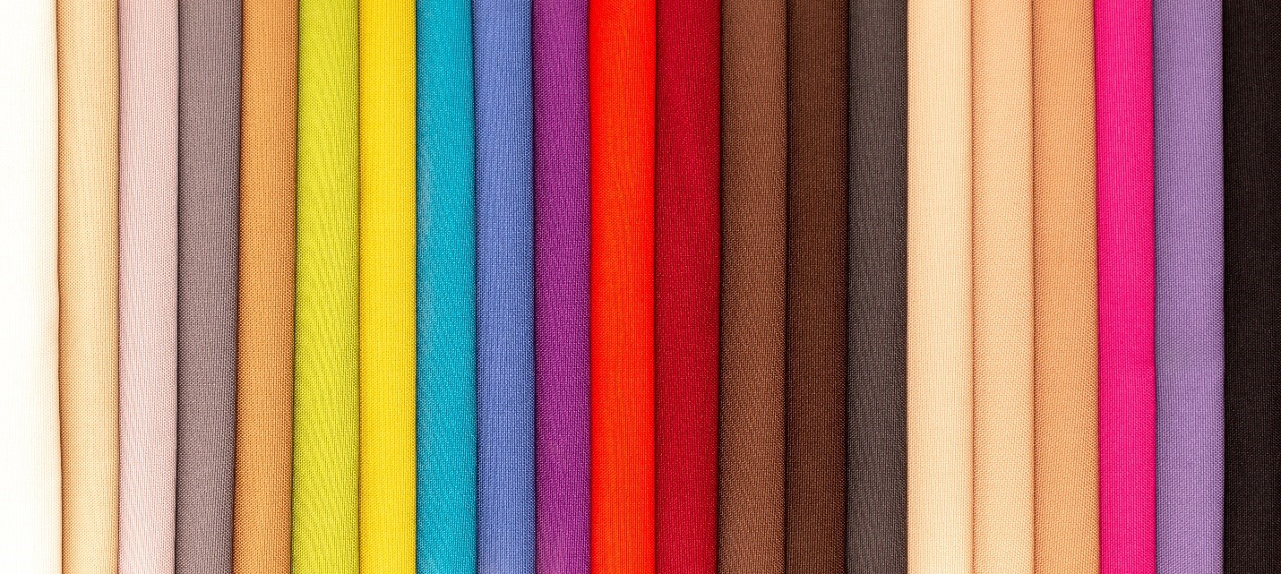
Warm Color Tones
Warm colors such as reds, oranges, and yellows can create a cozy and inviting atmosphere. These colors are particularly effective in living rooms, dining rooms, and other spaces where you want to encourage relaxation and conversation. Warm tones can make a room feel more intimate and welcoming, fostering a sense of comfort and conviviality.
Choosing Warm Blinds or Shutters
When incorporating warm tones, consider wooden blinds or shutters with a rich, warm stain. Honey, cherry, or mahogany finishes can add a touch of elegance and warmth to your room. These finishes can also enhance other wooden elements in the room, such as furniture and flooring, creating a cohesive look. Pairing warm-colored window treatments with neutral walls can prevent the space from feeling overwhelming. For example, if you have cream or beige walls, warm-toned blinds or shutters can add a pleasant contrast without clashing. Additionally, warm colors can be used to highlight specific areas or features in the room, drawing attention to windows as focal points.
Cool Color Tones
Cool colors like blues, greens, and purples can create a calming and serene environment. These colors are ideal for bedrooms, bathrooms, and other areas where you want to promote relaxation and tranquility. Cool tones can help reduce stress and create a soothing atmosphere, making them perfect for spaces dedicated to rest and rejuvenation.
Selecting Cool Blinds or Shutters
Opt for blinds or shutters in cool shades such as soft blue, sage green, or lavender. These colors can complement cool-toned walls and create a peaceful retreat. White or gray shutters can also work well in cool-toned rooms, providing a clean and modern look. These colors can make a space feel larger and more open, contributing to a sense of calm. Additionally, cool-toned blinds or shutters can enhance the natural light in a room, giving it a bright and airy feel. In bathrooms, cool colors can evoke the freshness of water and cleanliness, while in bedrooms, they can promote a restful and serene environment conducive to sleep.
Neutral Color Tones
Neutral colors like whites, grays, and beiges are versatile and timeless. They can work with any décor style and provide a neutral backdrop that allows other elements in the room to shine. Neutrals can create a sense of balance and sophistication, making them a popular choice for various interior design styles, from minimalist to traditional.
Using Neutral Blinds or Shutters
Neutral-colored window treatments are an excellent choice for any room. White shutters or blinds can brighten a space and make it feel more open and airy. Gray or beige shades can add subtle sophistication and blend seamlessly with various color schemes. Neutrals can serve as a blank canvas, allowing you to easily change other elements of your décor without worrying about clashing colors. Additionally, neutral tones can make a room feel more expansive and less cluttered. They are particularly effective in smaller spaces, where lighter neutral shades can help create the illusion of more space. For a touch of elegance, consider pairing neutral blinds or shutters with metallic accents or rich textures in your furnishings and accessories.
Wood Finishes
Wood finishes can add natural beauty and warmth to your home. Whether you prefer a rustic, traditional, or modern look, there is a wood finish that can enhance your décor. Wood blinds and shutters are timeless and versatile, able to complement a wide range of interior styles while adding a touch of sophistication and elegance.
Selecting Wood Blinds or Shutters
Consider the existing wood elements in your room, such as furniture, flooring, and cabinetry. Choose a wood finish that complements these elements. For example, if you have dark walnut furniture, matching walnut shutters can create a cohesive look, tying the room together and creating a unified aesthetic. If your décor features lighter wood tones, opt for blinds or shutters in a similar finish, such as oak or maple, to maintain a harmonious appearance. Additionally, consider the grain and texture of the wood; smoother finishes might suit contemporary styles, while more textured or distressed finishes can enhance a rustic or vintage look.

Choosing Contrasting Colors
Contrasting colors can add visual interest and drama to your room. This approach is ideal for creating a focal point or highlighting architectural features, making your windows stand out as a design element.
Bold and Vibrant Choices
For a bold look, consider vibrant colors that contrast with your walls and furnishings. Bright red or deep blue shutters can make a statement and add personality to your space. Use contrasting colors sparingly to avoid overwhelming the room. For example, if your room has a neutral palette, a pop of color on your window treatments can create an eye-catching focal point without clashing with the rest of the décor.
Subtle Contrasts
If you prefer a more subtle contrast, choose shades that are different but still harmonious. For example, soft gray shutters against pale blue walls can create a gentle and sophisticated contrast that adds depth without being overpowering. This approach works well in spaces where you want to add a touch of interest without drawing too much attention away from other design elements. Subtle contrasts can also add layers to your room’s color scheme, making it more dynamic and visually appealing.
Consider Lighting
Lighting plays a crucial role in how colors appear in your home. Natural and artificial light can affect the perception of color, making it essential to consider lighting when choosing your window treatments.
Natural Light
Observe how natural light affects the colors in your room throughout the day. Colors can appear different in morning light, midday sun, and evening shadows. Choose blinds or shutters that look good in various lighting conditions. For rooms with abundant natural light, consider lighter shades that won’t fade easily. Additionally, lighter colors can help reflect natural light, making the room feel brighter and more open.
Artificial Light
Different types of artificial light can also impact color perception. Warm incandescent bulbs can make colors appear warmer, while cool LED lights can enhance cooler tones. Test your chosen color under the lighting conditions in your room to ensure it looks as expected. If possible, bring home samples and view them at different times of the day and under various lighting conditions to see how they change. This step can help you avoid unexpected surprises once the window treatments are installed.
Personal Style and Preferences
While practical considerations like matching colors and lighting are important, don’t forget to consider your personal style and preferences. Your home should reflect your personality and taste.
Expressing Your Personality
Choose colors that resonate with you and make you feel comfortable. If you love vibrant, bold colors, don’t be afraid to incorporate them into your window treatments. On the other hand, if you prefer a more subdued and calming environment, opt for neutral or cool tones. Your home is an extension of yourself, so ensure that your choices make you feel happy and at ease in your space.
Adapting to Trends
While it’s tempting to follow the latest interior design trends, remember that trends come and go. Choose colors and styles that you genuinely love and can live with for an extended period. If you do want to incorporate trends, consider doing so with easily changeable elements like throw pillows and accessories rather than permanent fixtures like shutters or blinds.
Practical Considerations
In addition to aesthetic considerations, think about the practical aspects of your window treatments. Durability, maintenance, and functionality are important factors to keep in mind.
Durability and Maintenance
Choose materials and colors that are easy to maintain and can withstand everyday wear and tear. For example, lighter colors may show dirt and dust more easily, requiring more frequent cleaning. Consider the ease of cleaning and the longevity of the material when making your choice. Some materials, like faux wood or vinyl, are more resistant to moisture and warping, making them suitable for high-humidity areas like kitchens and bathrooms.
Functionality
Consider the purpose of the room and how the window treatments will be used. In a bedroom, you might want blackout blinds or shutters to block out light for better sleep. In a living room, you might prefer adjustable blinds that allow you to control the amount of light entering the room. Choose colors that enhance the functionality of your window treatments. For example, darker shades can provide better light control and privacy, while lighter shades can help brighten a space and make it feel more open.
Choosing the right color for your window blinds and shutters involves considering various elements, including wall paint, window trim, flooring, lighting, personal style, and practical considerations. Whether you prefer warm, cool, neutral, or contrasting colors, the key is to create a harmonious and balanced look that enhances the beauty and functionality of your home. By following these tips and considering your personal style, you can select window treatments that perfectly complement your décor and create a welcoming and stylish environment. Remember, the best choice is one that makes you feel happy and comfortable in your space! For expert advice and assistance, contact Long Island Window Treatments to help you find the perfect window solutions for your home!